
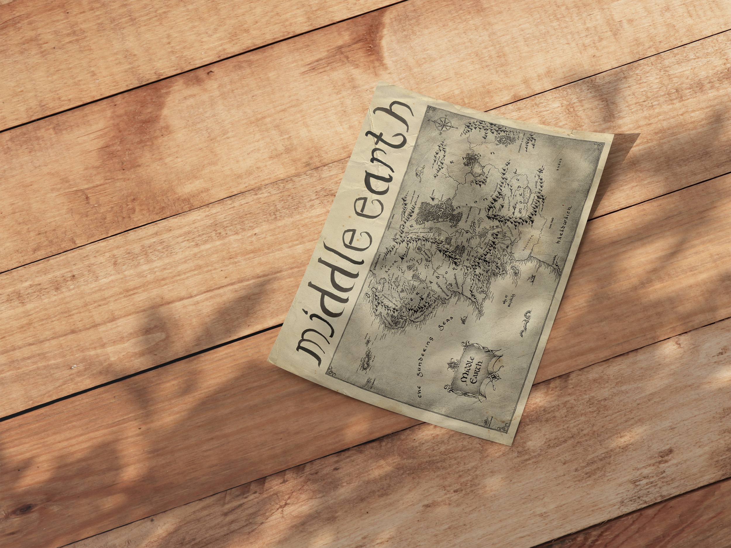
Neo-Quenya Display
Steeped in medieval fantasy as a kid, I was happy to delve into working with the theme of Tolkienian languages and fonts to create my own version of what a Neo-Quenyan (or High Elvish adapted by fans) script would look like in the Common Tongue (English). This project further pushed my typography creation skills beyond hand sketching to ink and then digital.
The Brief
This project was designed to create thoughtfulness around the beginnings of typefaces and how they evolve over time. As students, we were tasked with creating a faux “archeological field guide” to describe a typeface that we had “found”. I have always been drawn to the way that language evolves and adapts to the present times, and thus this project was fascinating and rewarding to me.
Iteration
Iteration consisted of becoming comfortable with using the medium of ink and paper, something I had never worked with before. I have always been fascinated by calligraphy, but never had a chance to dip into it myself. This process was greatly benefited by multiple iterations, but it did not take long before I created something that I believed was what I was looking for. However, when moving into the digital space, I had to surmount the fact that digitized paint does not have the same feel as it originally would, so I tried various ways to surmount this issue.
The Beginnings of the Alphabet
A More Italicized Iteration
A Less Italicized Iteration