
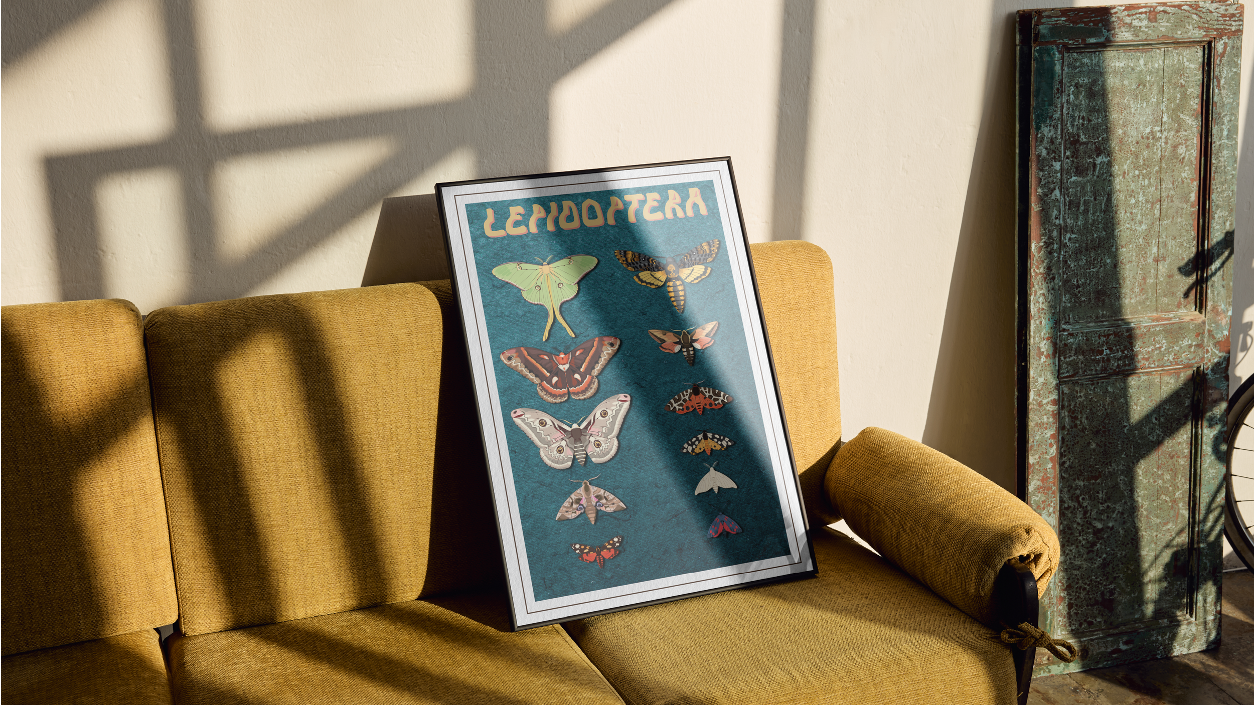
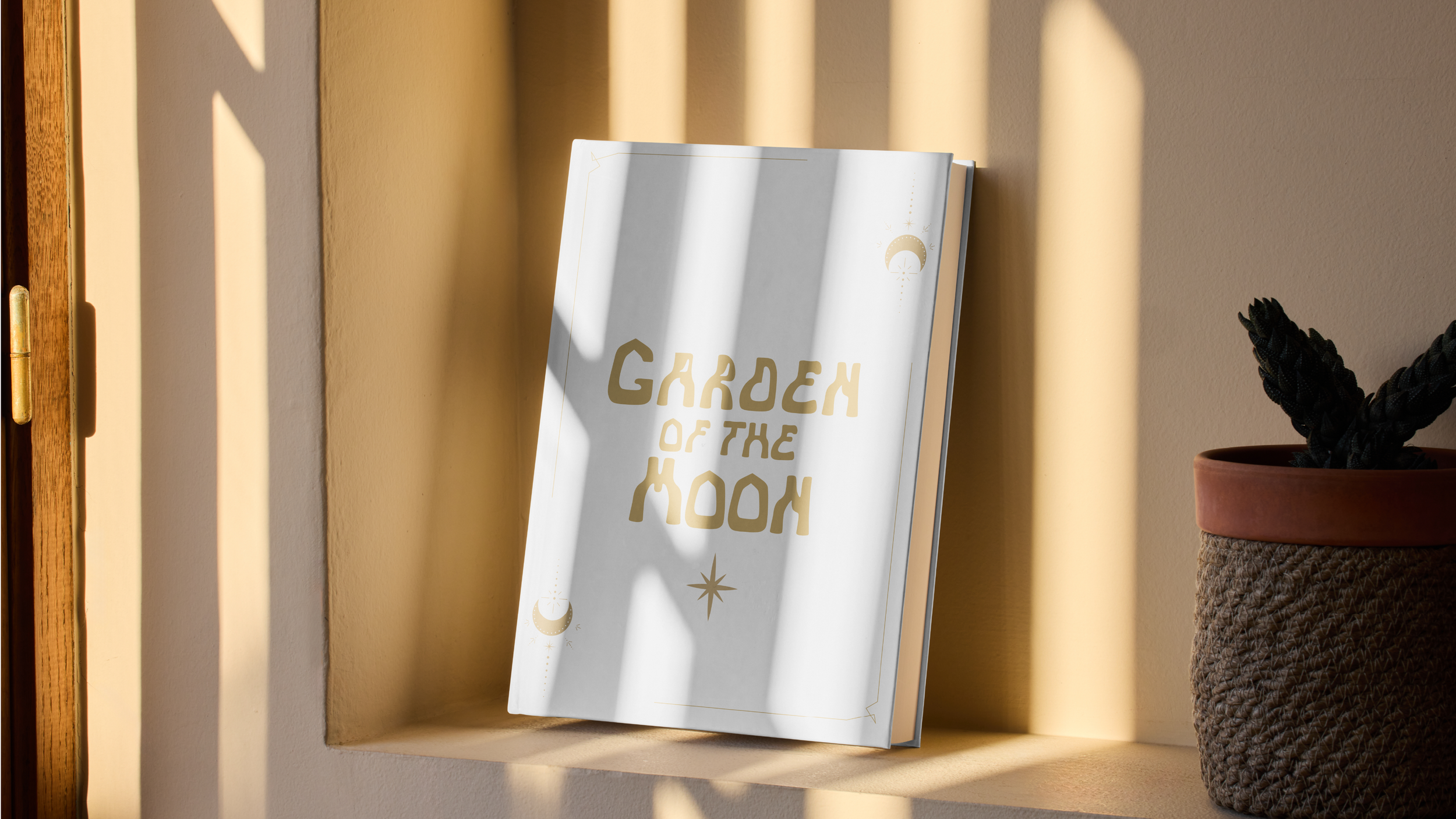
Novus Display
With the ideals and aesthetics of Art Nouveau fresh in my mind after learning about its causes and beginnings, I saw an opportunity to create something that aligned with that era as well as my own design aesthetic.

The Brief
The intent behind this project was to create a typeface that communicated a story. We were tasked to find a subject of inspiration for our work, conduct research on what qualities most reflect that subject, create preliminary sketches of our ideas, iterate the typeface by hand, and finally implement it digitally.
Original Sketches
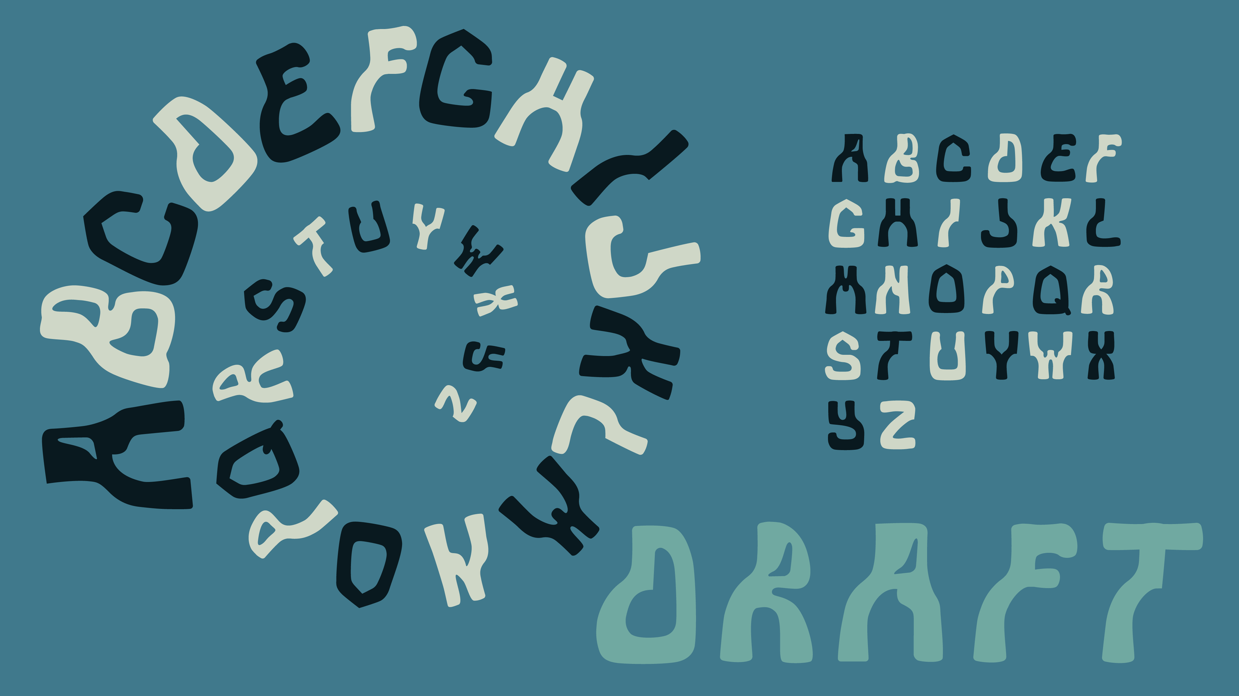
Process
The main portion of creating this typeface was creating a distinct visual style while making sure to keep the work consistent. The original inspiration for the lines and curves were rose stems and leaves, respectively. I wanted to keep the natural curvatures intact while maintaining legibility, as well. The process of reusing the forms of the “i” and “o” was integral in maintaining the backbone of my inspiration and also lent itself to a well-rounded visual identity.
First Iteration Pt. 1
First Iteration Pt. 2